Adaptive Strategy Monitoring: A VAWG Dashboard Prototype
This prototype is internal and password-gated for now. The code and catalogue are not yet public. This post is about the design thinking rather than a working demo.
The UK published a new cross-government strategy to address violence against women and girls in early 2026. Freedom from Violence and Abuse is a genuine, serious document: four pillars, nine strategy years, fifteen or more departments with named responsibilities, a published action plan, and a formal performance framework.
The question that interests me is not whether the strategy is a good one. It is this: what does it actually mean to monitor something like that?
The problem with activity tracking
Most strategy monitoring tools answer the wrong question. They count commitments completed, actions delivered, and quarterly progress traffic-lighted. That is not useless, but it is not the same as asking whether the strategy is working. You can deliver every action in a plan and still see the headline harm indicators barely move.
The National Audit Office and the Public Accounts Committee have both made this point about VAWG work specifically. Fragmented reporting, weak cross-government visibility, uneven evidence quality, and short-term funding cycles have made it consistently hard to link what the system is doing to what is actually changing. That gap is where this prototype is trying to sit.
There is a harder design challenge underneath that, though. How do you show the relationship between interventions and outcomes without implying causality you cannot demonstrate?
A school-based consent education programme may take a decade before any effect shows up in national prevalence data, if it shows up at all in a way that is attributable. Putting that programme on the same scorecard as a police response metric and giving both a red or green status is not just misleading, it is actively harmful to the strategy. It misaligns expectations, penalises prevention work for its natural time horizon, and rewards short-term visible activity over longer-term structural change.
That framing drove most of the design choices here.
Intervention families and a catalogue with typed links
The data model is built around intervention families: stable groupings of related policy actions and delivery packages that can absorb changes in government priorities without requiring a structural rebuild every time a new action plan is published.
These families sit within the four strategy pillars, but they are designed to be more durable than any single action plan cycle. The current prototype has 20 families, covering everything from “Healthy relationships, consent and school-based prevention” to “Housing, safe accommodation and rehousing pathways”, with cross-cutting enablers like “Data, evidence, evaluation and test-and-learn” kept deliberately separate from the direct intervention families.
The navigation is a tree. The data model underneath is a directed acyclic graph. One policy action can support multiple families. One metric can be a primary outcome for one family and a contextual background indicator for another. That flexibility is harder to implement than a flat lookup, but it reflects how these systems actually work.
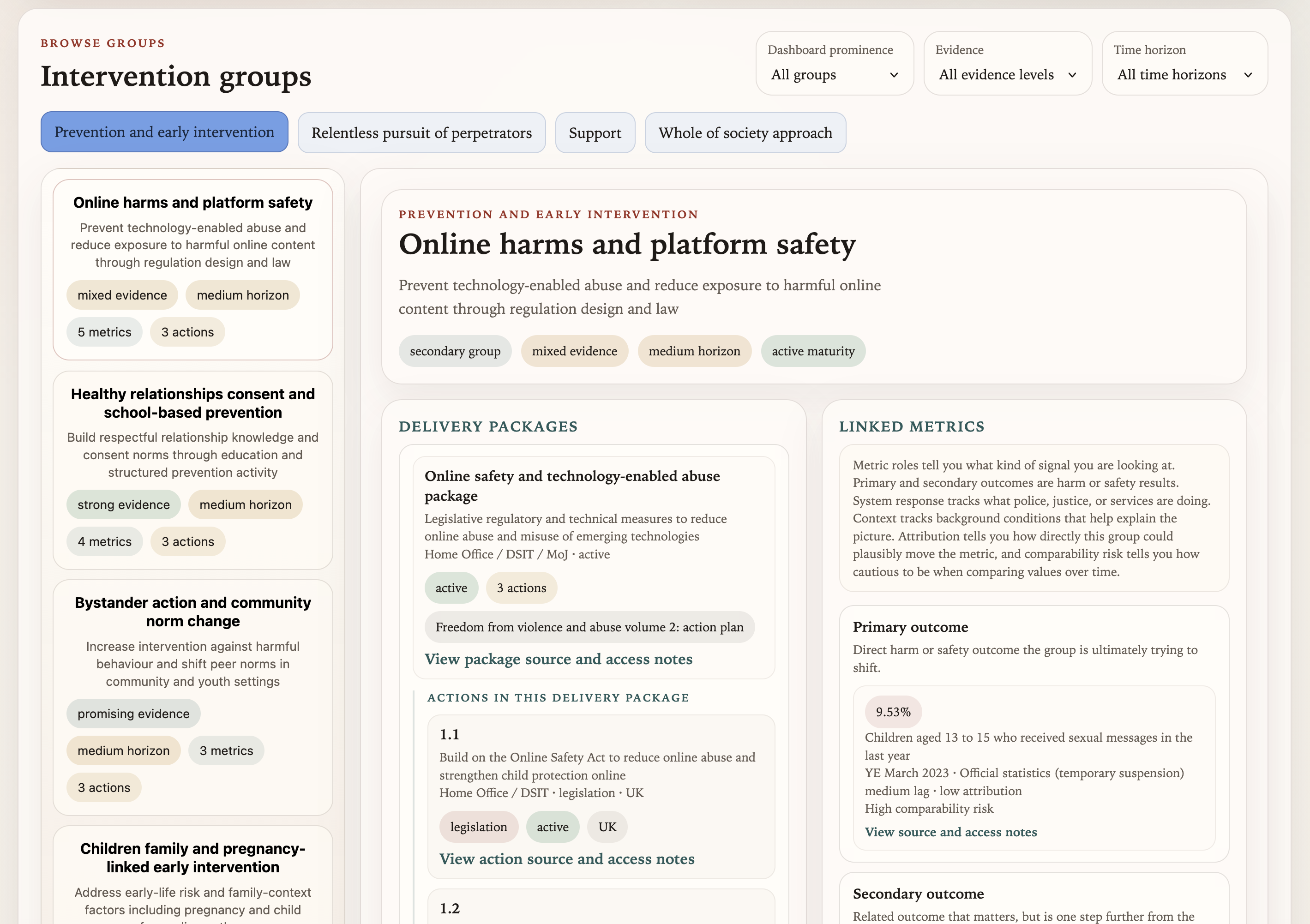 The intervention groups browse view, showing families grouped within pillars, with delivery packages and linked metrics visible in the detail panel.
The more consequential design choice is how metrics are linked to families. Rather than a flat “this family is tracked by these metrics” relationship, every link carries a role: one of primary_outcome, secondary_outcome, system_response, service_use, capacity, context, or delivery_proxy. Each role also records an expected lag (short, medium, long) and an attribution strength (high, medium, low).
The diagram below shows what this looks like for a single family:
flowchart TD
    subgraph Pillar["Pillar: Prevention and Early Intervention"]
        F["Healthy relationships, consent\nand school-based prevention\n(strong evidence / medium horizon)"]
    end

    M1["Sexual harassment prevalence (16+)\nprimary outcome · medium lag · medium attribution"]
    M2["Children: attitudes towards consent\nprimary outcome · medium lag · high attribution"]
    M3["Combined VAWG prevalence (16+)\nsecondary outcome · long lag · low attribution"]
    M4["Police-recorded VAWG crimes\nsystem response · short lag · low attribution"]
    M5["DA homelessness duty owed\nservice use · short lag · low attribution"]

    F -->|"primary outcome"| M1
    F -->|"primary outcome"| M2
    F -->|"secondary outcome"| M3
    F -.->|"system response"| M4
    F -.->|"context"| M5

    style F fill:#6366f1,stroke:#fff,stroke-width:2px,color:#fff
    style M1 fill:#10b981,stroke:#fff,stroke-width:2px,color:#fff
    style M2 fill:#10b981,stroke:#fff,stroke-width:2px,color:#fff
    style M3 fill:#f59e42,stroke:#fff,stroke-width:2px,color:#fff
    style M4 fill:#38bdf8,stroke:#fff,stroke-width:2px,color:#fff
    style M5 fill:#1e293b,stroke:#94a3b8,stroke-width:1px,color:#94a3b8
This matters because “Healthy relationships and consent” should not be judged primarily on whether the combined VAWG prevalence figure fell this year. That metric is linked to the family, because there is a plausible long-run relationship, but it carries a secondary_outcome role with long lag and low attribution. The nearer-term primary outcomes are things like sexual harassment prevalence among young people and attitudinal measures. Those are the signals the dashboard uses when asking whether the family is doing anything observable within its intended time horizon.
Metric quality and the comparability problem
One of the more honest things this prototype tries to do is surface uncertainty rather than hide it.
54 metrics are currently seeded in the dashboard. A significant number carry comparability risk, methodology breaks, or “official statistics in development” flags. Some series have been revised enough times that comparing the current value to a figure from three years ago requires reading the methodology notes before drawing any conclusions.
The year-on-year colour coding in the projection view (green for movement in the desired direction, red against, grey for flat, blue for signals needing contextual interpretation) is deliberately year-on-year rather than cumulative against a fixed baseline. Baselines mislead when the underlying series changes its methodology. Showing only the gap from the previous year, with explicit comparability notes surfaced alongside the figure, is a more honest representation of what the data can and cannot say.
Each metric also has a generated “why this year reads this way” paragraph, a review lens, and a set of suggested research questions. These are serialised to JSON and are intended for SME editing before any stakeholder use. The point is not to provide automated verdicts, but to orient the right questions for someone doing a proper strategic review. A dashboard that gives a number without helping you know what to ask about it is not very useful.
The grounded AI assistant
The prototype includes a floating AI assistant on the Live Strategy page. I want to describe this carefully, because the approach is deliberately constrained.
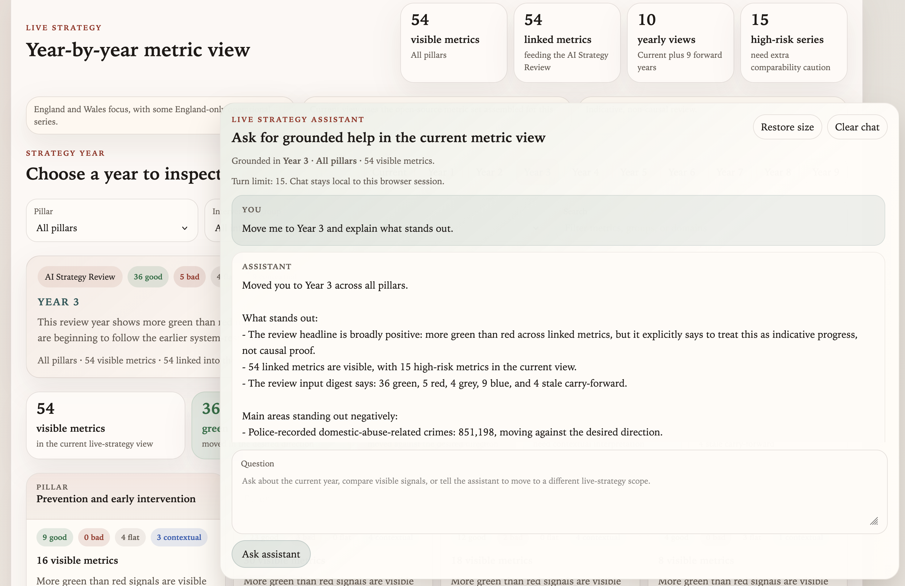 The Live Strategy page showing year-by-year metric signals alongside the grounded assistant panel. Suggested prompts are built from the current view scope.
The assistant is grounded in the current view state: whichever strategy year, pillar, and family scope is currently selected. It can answer questions like “What looks strongest in the current year?” or “Which visible metrics carry the highest comparability caution?” It can also apply safe view changes when asked (“Move me to Year 3 and tell me what stands out”), applying those as live UI updates rather than just describing them.
What the assistant will not do is answer general policy questions or claim that a movement in a metric demonstrates that an intervention worked. The system prompt is designed to keep it within the scope of what the current view actually shows. It has access to the current snapshot data, the family and metric link structure, and the pre-generated review context. It does not have access to external sources or general policy knowledge beyond that bundle.
The implementation is a single Vercel serverless function. It receives the user message, the current UI state, and recent conversation history, rebuilds context from the bundled snapshot data, and calls an LLM server-side through Vercel’s AI Gateway. Session history is capped at 15 turns and stored in browser sessionStorage only. No shared server-side memory, no cross-session persistence.
It is a deliberately thin architecture. The interesting part is not the function itself, but getting the grounding right: making the context bundle tight enough that the assistant can answer grounded questions about 54 metrics across 20 families without either hallucinating data or drifting into general commentary about VAWG policy. The enveloping concept I wrote about previously applies here just as much as it does in agentic coding contexts. The assistant is more useful because the world around it is well-structured, not because the model is especially clever about VAWG strategy.
What this is, and what it is not
This is a prototype, and a manually seeded one. The current projection values are static demo assumptions rather than live forecasts. The AI-generated review paragraphs are a starting point for human editing, not finished analysis.
What I think works about this model, even at prototype stage, is the ontology. Getting the intervention families right, making the metric link roles explicit, and encoding the time horizon and attribution expectations directly into the data structure: those choices make the dashboard useful for coordination and scrutiny in a way a flat activity tracker cannot be. The catalogue currently holds 20 families, 54 metrics, 94 typed family-metric links, and 79 policy actions mapped to delivery packages. That is enough structure to make the prototype feel real rather than illustrative.
The next layer would be live ingestion from ONS, Home Office open data, CPS quarterly tables, and Ministry of Housing, Communities and Local Government housing statistics. That is a significant engineering step, but the data model is designed to support it: every metric carries a source family, a canonical publication page URL, a discovery strategy, and comparability metadata, ready for an extraction layer when the time comes.
For now, the prototype is doing what prototypes are for: testing whether the model is understandable, whether the metric links feel analytically useful, and whether the AI assistant adds anything or just adds noise. The early answer to all three is cautiously positive.